| Telecommunications
Telegrams
and Telephones
As society advances we rely more and more on communications. Sometimes older methods are
replaced by new ones.
Telegrams are an example. In the fifties, business and (private) individuals sent about
25 million inland telegrams a year. Nowadays less than a quarter of that number are sent.
More people have telephones.
- Why do you think people prefer using a telephone to sending telegrams?
- Write down one advantage of telegrams over telephones.
- Who needs to know about the number of telephone calls made and telegrams sent?
More
Details
Table 6 shows the number of inland telegrams sent and telephone
calls made over the period 1965 to 1974.
Notice that the telegrams are counted in millions, but the telephone calls are counted
in billions (1 billion = 1000 million).
- Plot the information in Table 6 on a graph. Both sets of figures
can be plotted on the same graph. Use two vertical axes. as shown in Figure 3. Note that
the scales will need to be different. Plot the telegrams with dots ·
and the telephone calls with crosses +.
(Source: Annual Abstracts)
Table 6 - Inland telegrams sent and telephone calls, 1965- 1974.
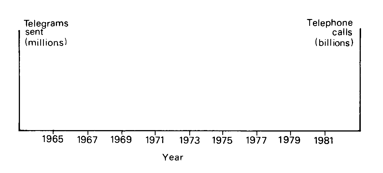
Figure 3 - Telegrams sent and telephone calls.
- Find the mean number of telephone calls and of telegrams sent per annum. Notice that
there are 10 years this time. Think carefully where the central points should be in each
case, and plot them.
- Draw a line of best fit for each set of figures. Use the central point to help you. Draw
the line for telegrams in one colour and that for telephone calls in another.

Predictions
- Use your line to estimate the number of telegrams sent in 1975, 1977 and 1981.
- Use your line to estimate the number of telephone calls made in 1975, 1977 and 1981.
- Which of these predictions do you think will be the most accurate? Give reasons.
The figures for 1975, 1976 and 1977 are shown in Table 7.
(Source: Annual Abstracts)
Table 7 - Annual number of telegrams sent and telephone calls made, 1975-1977.
- Find the difference between your estimates for telegrams sent and the correct answers
given in Table 7. Make sure you state the units.
- Find the difference between your estimates for telephone calls and the correct answers
given in Table 7.
- Are there anv surprising differences? Write down what surprised you most about your
answers to d and e.
- *Plot the correct telegram figures for 1975, 1976 and 1977 on your graph. Work out and
plot a new central point for the 13 years 1965-1977. Draw in a new trend line and use this
line to find a new estimate for 1981.
- *Find the difference between the two estimates you now have for 1981. Which is more
likely to be right? Explain your answer.
- *In a similar way find a new estimate for telephone calls in 1981 and compare it with
your previous estimate.
- Why is it necessary to use the most recent data available when making estimates of
future events?
Interpreting
Trends
Look at the graph vou have drawn of inland telegrams and telephone calls in the 10 vears
1965-1974.
- What happened to the number of telegrams sent? Why do you think this is so? Do you think
the trend will continue?
- What happened to the number of telephone calls? Why do you think this is so? Do you
think the trend will continue?
- Write down any other technological developments that you think may affect these trends,
and the possible effects on them.
Britain
Past and Present
You have studied how various figures changed in 10 years. Some figures relate to private
use, some to industrial use.
- Describe in a few sentences what the television figures show about Britain.
- Describe in a few sentences what the cinema figures show about Britain.
- Describe in a few sentences what the telephone figures show about Britain.
- Describe in a few sentences what the telegram figures show about Britain.
- Write down some other figures you might collect to show statistically how Britain
changed over the same period of time.
|